Hey there, folks! If you’ve been scrolling through your Amazon app or website lately, you might have noticed something a bit different. That’s right—Amazon has rolled out a new logo for the first time in over two decades! This isn’t just a tiny tweak; it’s a big deal for a company that’s been a global retail giant since its founding in 1994. Here at TheMors, we’ve dug into the details of this Amazon logo redesign 2025 to bring you the full scoop. From what’s changed to why it happened, let’s break it all down for you.
- A Subtle Yet Powerful Change: What’s New in the Amazon Logo?
- Why Amazon Decided to Refresh Its Logo Now
- A Need for Unity Across a Massive Brand
- Keeping Up with the Times
- How the Redesign Impacts Amazon’s Sub-Brands
- A New Visual System for Consistency
- Modernized Typography with Ember Modern
- What People Are Saying About the New Logo
- The Bigger Picture: Why Logo Updates Matter
- What’s Next for Amazon’s Brand Journey?
- Final Thoughts: A Logo That Smiles Brighter
A Subtle Yet Powerful Change: What’s New in the Amazon Logo?
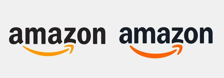
Amazon’s logo has been a familiar sight since 2000, with its iconic smile-shaped arrow stretching from “A” to “Z.” That arrow, often called the “Amazon smile,” represents the company’s promise to deliver everything from A to Z with a customer-friendly vibe. But as of April 2025, the logo has gotten a fresh look, and while the changes might seem small at first glance, they pack a punch. hello-sante.fr
The redesign was led by the branding agency Koto, working alongside Amazon’s internal design team, Amazon XCM. Here’s what’s new:
- A Warmer Smile: The signature arrow is now thicker and has a deeper, more vibrant orange hue—dubbed “Smile Orange.” This tweak makes the smile feel more genuine and friendly, reflecting Amazon’s aim to connect emotionally with its customers.
- Updated Typography: The “amazon” wordmark now uses a custom font called Amazon Ember Modern. The letters are softer and more rounded, with subtle adjustments like a less sharp “a” and a wider “m,” giving the logo a modern yet approachable feel.
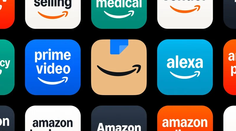
- Unified Sub-Brands: Amazon has over 50 sub-brands—like Prime, Alexa, and Fresh—and their logos have been streamlined to match the new design system. This ensures consistency across the board, whether you’re shopping for groceries or streaming on Prime.
I first noticed the change while ordering a book on the app last week. The logo felt… warmer, somehow. It’s still the Amazon we know, but with a fresh twist that makes it feel more in tune with today’s vibe. The update took 18 months to complete, spanning 15 global markets, which shows just how much thought went into this rebrand.
Why Amazon Decided to Refresh Its Logo Now
A Need for Unity Across a Massive Brand
Amazon has grown a lot since its early days as an online bookstore. Today, it’s a retail giant with fingers in everything from cloud computing to healthcare. But with that growth came a challenge: its brand identity had become fragmented. Sub-brands like Amazon Fresh and Alexa had developed their own visual styles, which didn’t always align with the main Amazon look. This lack of consistency made it hard for the company to present a unified front.
Koto’s team pointed out that as Amazon scaled at an incredible speed, its brand system struggled to keep up. Logos, fonts, and colors started to vary across teams and regions, which wasn’t ideal for a company that relies on trust and recognition. The 2025 Amazon logo update is all about bringing everything back together under one cohesive identity. Think of it like a family reunion—everyone’s now speaking the same visual language, from the website to delivery vans.
Keeping Up with the Times
Another reason for the redesign is to stay relevant. The last major logo update was in 2000, and a lot has changed since then. Back then, Amazon was still proving itself as a retailer. Now, it’s a household name used by billions. The new logo reflects this evolution, aiming to feel more modern and emotionally engaging. The deeper orange and refined font are small changes, but they signal that Amazon is moving with the times while staying true to its roots.
I’ve seen this happen with other brands too. Just last month, a friend mentioned how Google updated its logo with a gradient—its first change in a decade. It seems 2025 is the year for big brands to refresh their look, and Amazon didn’t want to be left behind.
How the Redesign Impacts Amazon’s Sub-Brands
A New Visual System for Consistency
One of the biggest parts of this rebrand is how it affects Amazon’s sub-brands. With over 50 sub-brands under its umbrella, Amazon needed a system that could tie everything together. The new logo architecture does just that. Each sub-brand now follows the same design rules, using the Amazon Logo Sans font and a unified color palette.
For example:
- Amazon Fresh now uses fresh greens to reflect its grocery focus.
- One Medical, Amazon’s healthcare brand, has a turquoise green inspired by medical scrubs.
- Prime aligns its typography with the main Amazon logo, keeping the iconic smile arrow.
This isn’t just about looking good—it’s about making the brand scalable. Koto even built an automated tool called “[amazon]:name” to generate new logos for sub-brands instantly, ensuring they all fit the system. It’s a smart move for a company that’s always expanding.
Modernized Typography with Ember Modern
The typography update is another key piece. Amazon has been using the Ember font since 2016, originally developed for Kindle. But as the company grew, Ember wasn’t always the best fit for every use case. The new Ember Modern font fixes that. It’s designed to be versatile—bold and playful for marketing, but subtle for functional digital moments. I think this change makes the brand feel more polished, especially on smaller screens like my phone.
What People Are Saying About the New Logo
The response to the Amazon logo refresh 2025 has been mostly positive, though some fans needed a minute to adjust. On social media, I’ve seen posts praising the warmer vibe, with one user saying, “The new smile feels like Amazon is actually smiling at me!” Others noted the subtle changes, with comments like, “I didn’t even notice at first, but now I can’t unsee the new orange—it’s so much brighter.”
There were a few skeptics, though. Some users felt the changes were too small for an 18-month project, with one post joking, “Amazon spent 18 months to make the arrow a bit thicker? Really?” But overall, the consensus seems to be that the update is a smart, understated evolution. It’s not a drastic overhaul, and that’s the point—Amazon didn’t want to mess with a logo that’s already iconic.
I get why some might think the changes are minor. When I first saw the new logo, I had to squint to spot the differences. But after using the app for a few days, I can see how the tweaks make the brand feel more cohesive and friendly. It’s like a glow-up you didn’t know you needed.
The Bigger Picture: Why Logo Updates Matter
Building Trust Through Consistency
A logo isn’t just a pretty design—it’s a symbol of trust. For a company like Amazon, where billions of people shop every day, consistency is key. The 2025 rebrand shows that even the biggest brands need to check in and refresh their identity every now and then. By unifying its sub-brands and modernizing its look, Amazon is making sure it stays recognizable and reliable, no matter where you encounter it.
I’ve always thought a good logo is like a handshake—it sets the tone for your relationship with a brand. Amazon’s new logo feels like a firmer, friendlier handshake, which is exactly what they were going for.
Staying Competitive in a Changing Market
The rebrand also positions Amazon to stay competitive. With other retail giants refreshing their looks—like Walmart’s recent “spark” update or Honda’s new logo for its electric vehicles—Amazon needed to keep up. The new design system ensures the brand can grow seamlessly, whether it’s launching new services or expanding into new markets.
What’s Next for Amazon’s Brand Journey?
This logo update is just the beginning. Amazon is already rolling out the new design across its assets—think websites, packaging, delivery vans, and even uniforms. But given the company’s massive scale, it’ll take a few months to see the changes everywhere. I’m curious to see how the new look will play out in their holiday campaigns later this year—those always make a big splash.
There’s also talk of more updates down the line. Some posts on social media mentioned that Amazon might be testing a logo-less app design, with a big search bar replacing the traditional logo on the homepage. Whether that becomes permanent or not, it’s clear Amazon is thinking about the future of its brand in a big way.
Final Thoughts: A Logo That Smiles Brighter
Amazon’s logo update in 2025 might seem small, but it’s a thoughtful step forward for a brand that’s been around for over 30 years. The thicker, warmer smile, the modernized font, and the unified sub-brand system all show that Amazon is ready for the next chapter. It’s still the same Amazon we know and love—just with a fresher, friendlier face.
Here at TheMors, we’re always on the lookout for stories that matter to you. Want to stay in the loop on more branding updates, tech news, or retail trends? Head over to TheMors – Breaking News for the latest insights and updates. There’s always something new to discover—don’t miss out!